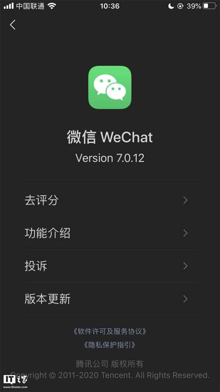
This morning, WeChat iOS version has received the 7.0.12 update, which officially added support for dark mode. The WeChat 7.0.12 update log indicates that the app will follow the system settings and switch to dark mode. iOS users have reported that the overall implementation of the dark mode is 99% complete, but of course, there are still some defects in some places.
According to Tencent, at present, the dark mode of the WeChat Android version has also been tested in grayscale, and it will be fully launched soon.
The dark version of WeChat for Android will launch soon

It is worth to mention that the majority of apps and services has already offered a dark mode, and the last to integrate it was Facebook for desktop. The new social network interface is now available to all users. In addition to a completely redesigned interface, a dark mode can now be activated.
Almost a year after the appearance of the dark mode on the Messenger mobile application, and more recently on WhatsApp, Facebook is finally deploying the new version of its interface with dark mode for all users.
Also, a few weeks ago, WhatsApp has officially announced the arrival of the dark mode to the stable version of the app. The update that brings this mode has been already available for Android and iOS in the past weeks.
What are the pros and cons of Dark Mode?
The dark theme comes with its share of advantages and disadvantages.
Pros:
- It saves energy, mainly if the device uses an OLED or AMOLED screen.
- While the dark text on a white background is the best in terms of readability, Dark Mode (which has light text on a dark background) is better for reducing eye strain in low light conditions.
- With the majority of the screen dark, the screen glare is reduced, thereby minimizing flickering and blue light.
Cons:
- Dark themes are not always better for eye strain. In bright light conditions, the text appears washed out, increasing eye fatigue.
- Long pieces of content or text are more challenging to read in Dark Mode.


Place comments
0 Comments
You are currently seeing only the comments you are notified about, if you want to see all comments from this post, click the button below.
Show all comments