Google has just announced that the upcoming Android Q will be called just "Android 10". This time around, the search giant decided to completely leave the dessert-based names in favor of number versions. The company has been since the early days of Android adopting dessert names for each Android version.
This strategy helped to build an own personality for Android, that was different from Microsoft and Apple with its numbered OS updates. Every year users tried to guess which flavor Google would take to name its next Android version. The company even created a partnership with companies like Nestle for a KitKat themed Android and Mondelez' Oreo. Now that Android is huge, the company decided to change its approach.
All the Android versions and its flavors until today:
- 1.6 - Donut
- 2.0/2.1 - Eclair.
- 2.2 - Froyo.
- 2.3 - Gingerbread.
- 3.0/3.1/3.2 - Honeycomb.
- 4.0 - Ice Cream Sandwich.
- 4.1/4.2/4.3 - Jelly Bean.
- 4.4 - KitKat.
- 5.0/5.1 - Lollipop.
- 6.0/6.0.1 - Marshmallow
- 7.0/7.1/7.1.1/7.1.2 - Nougat
- 8.0/8.1 - Oreo
- 9.0 - Pie
With the release of Android 10, Google leaves the alphabetical dessert naming scheme to make the names more accessible across more markets. That makes sense, after all, not everyone in the globe is familiarized with some of the flavors listed above. Moreover, Google is also changing the Android logo and mascot. The Android robot has been the company mascot since the very first release. Over the years, the robot changed colors from a yellowish-green to a lemon green and now finally to a bluish-green. Back in the days, it was transformed into a bee to promote HoneyComb.
Google states that the change in color is more than aesthetic and is in line with the company policy to make Android more accessible. The previous green color was not visible for those with color-blindness. Interesting enough, green-red blindness is the most common type of color blindness. The company added more blue tones, making it more visible for those suffering the problem.

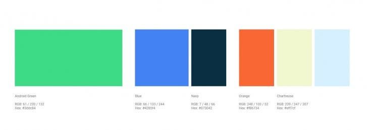
Google also introduced a few other colors that will be used alongside the new Android Green (#3ddc84), which includes Blue (#4285f4), Navy (#073042), Orange (#f86734), Chartreuse (#eff7cf) and an unspecified sky blue shade. The new colors will be present among assets and packaging and also have been chosen to improve the software's accessibility.
New Android Logo

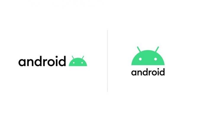
Not even Android's logo has escaped from the changes. The text or the wordmark now has a different font, which is more circular with curvatures that match the robot's curves. When it comes to the green robot, the head is now part of the Android logo. It will appear either after Android's logo or above it, depending on the context.
While this seems simple at first sight, it's a massive change for Android's brand as a whole. With the advent of more robust Custom versions of Android, the search giant wants to give more traction to the vanilla Android. The next version will come pretty soon, perhaps in the next month. So stay tuned for more details about the future of Android.


Place comments
0 Comments
You are currently seeing only the comments you are notified about, if you want to see all comments from this post, click the button below.
Show all comments