We have known for a number of months that Google is working on Android Auto, a platform that makes it simple to connect your smartphone to your car for a full entertainment experience. Finally, it appears that there are some significant advances.
We are unmistakably referring to Coolwalk, the term for the new graphical user interface that Google has created for Android Auto and which is expected to be a type of revolution for Google's in car system. Actually, the new Android Auto has been in testing by a select few lucky people thus far.
Google has been working hard over the past six months to build and polish the latest version of Android Auto, in part because of the input given by the users who tested it. The initial public beta version appears to be ready for a global release at last.
So, given the most recent updates made by Google, let's examine what to anticipate from the brand-new Android Auto:
New app bar
The photographs that follow clearly demonstrate one of the wonderful developments that the new Android Auto will bring.
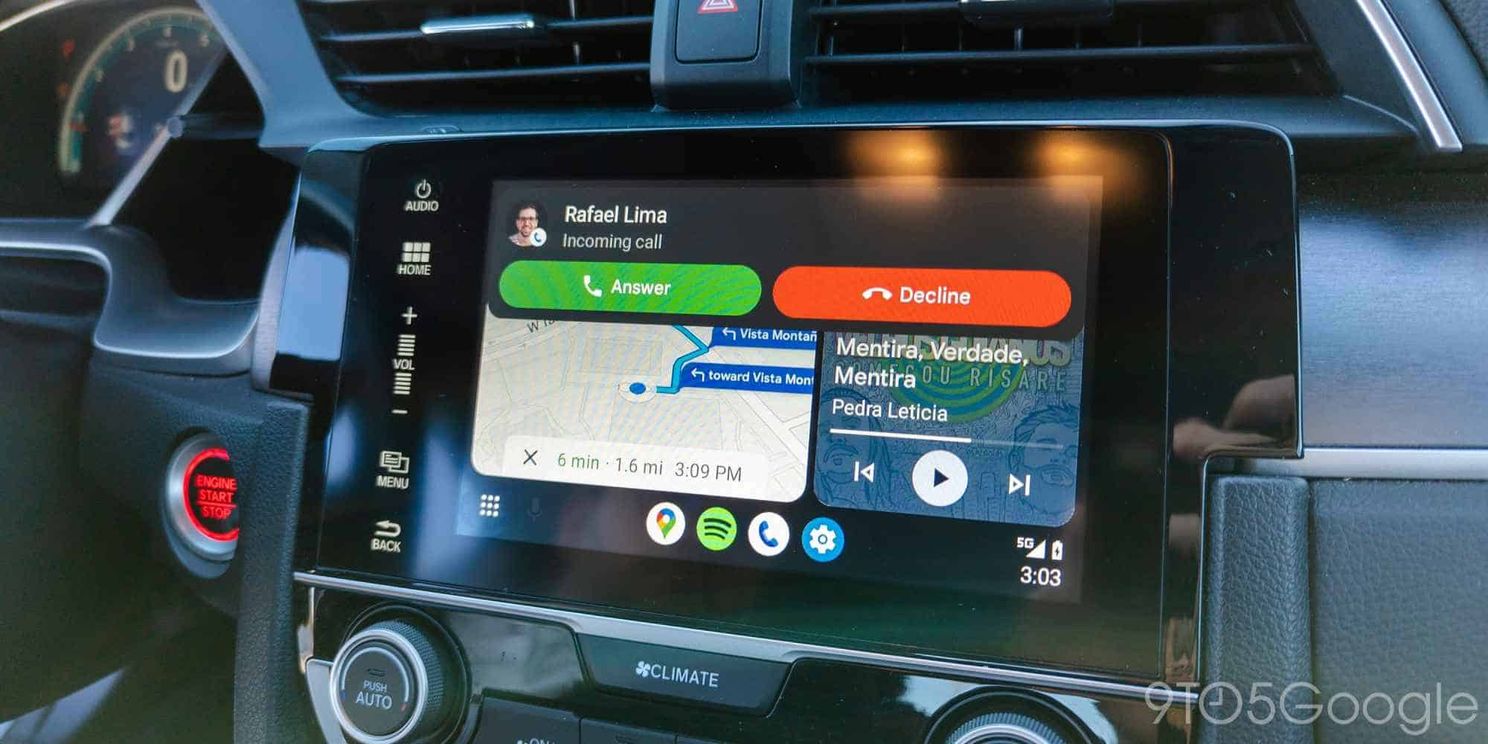
Multitasking will be simpler thanks to the central app bar. The Maps icon will always be present because it is clear that it is for a car system. While the other icons will depend on the user's usage patterns. The phone signal, battery, and notification indicators are visible to the right of this bar. The direct link to activate Google Assistant is located on the left.
Multitasking
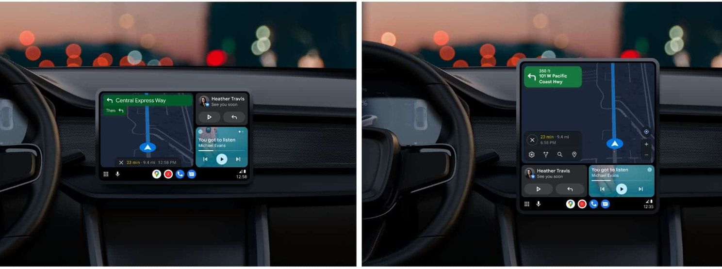
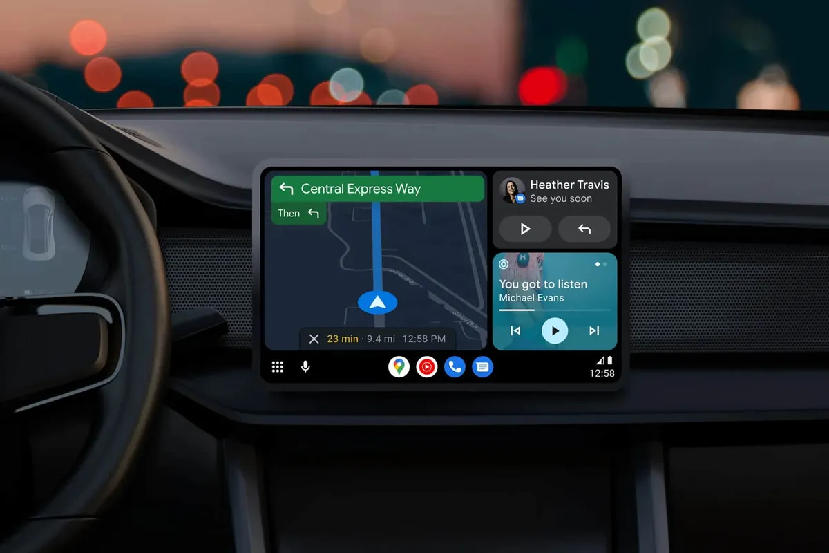
The ability to run two apps side by side in the split screen at once will be one of the new Android Auto's most distinctive features. For obvious reasons, the area designated for Google Maps will occupy a bigger section of the screen.
The second portion of the screen will be dynamic, allowing the user to launch the multimedia content app they use the most frequently while also being prepared to host the Phone app in case they get a call.
There are also improvements for multimedia apps, all within the context of the new Android graphical user interface. The image below demonstrates how the multimedia playback control buttons take on a different shape depending on the playback's current status.
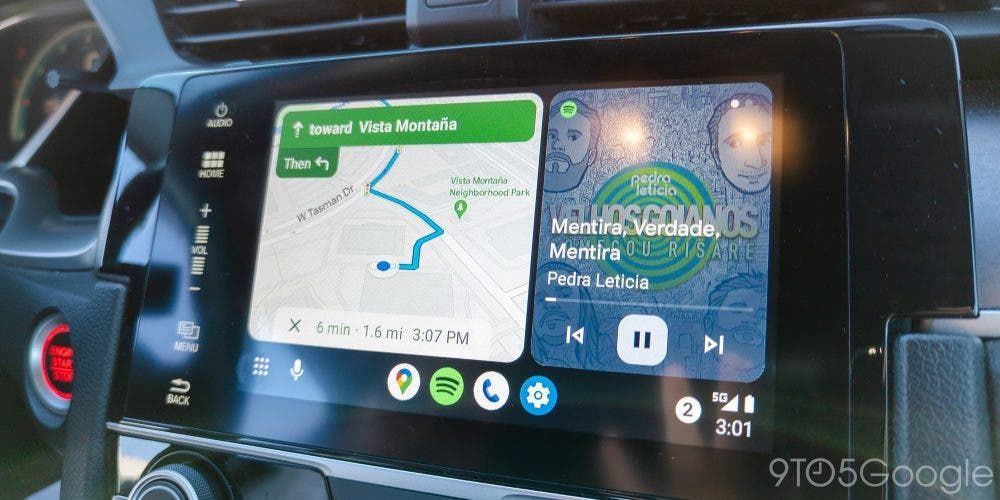
Notifications and unread messages have also been refreshed, and they now appear more comprehensible and immediate. Overall, it appears that the new Android Auto aims to offer a user experience that is more immediate and approachable. Similar to what Apple's CarPlay provides.
Thanks to the regular leaks on the internet. We have watched the new Android Auto develop over the past six months. It is likely going to have some critical issues and bugs found by users who tested it in the preview.
When will the updated Android Auto launch?
The beta version of the new Android Auto is currently available to the public. It is obvious that the only people who will get it are those who have signed up for the beta program. At least a few more weeks will pass before the others can wait. Sadly, the Android Auto beta has been finished for a while. And there is little chance that it will be expanded anytime soon.
There is still hope for users who don't sign up for the beta. However, you can try right away by manually installing the most recent Android Auto beta version. You can download the apk and install it from third-party stores. Since it appears to be heavily dependent on a server-side update, there are currently no confirmations that using this solution actually enables you to have the most recent version of Android Auto.


Place comments
0 Comments
You are currently seeing only the comments you are notified about, if you want to see all comments from this post, click the button below.
Show all comments