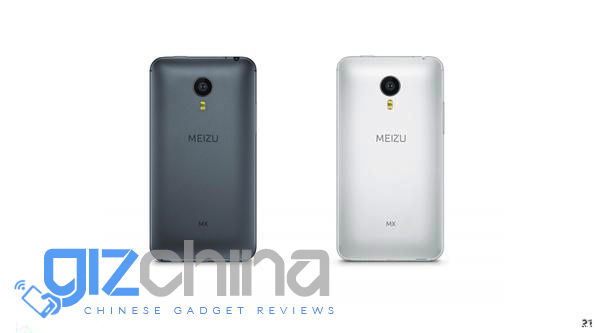
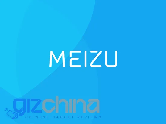
Starting from last year we saw a huge change in the way Meizu want to be viewed by the world, and those will continue with a new rumoured Meizu logo design.
For companies in the West changing a company logo is a risky and tricky endeavour. Usually a change is subtle with just enough of a styling change to give a fresh new modern look.
Although they have a long history in the Chinese tech industry, Meizu look like they want to leave behind the ‘old Meizu’ and create a new phone with new look, feel and goals.
The new Meizu Logo is going to come as quite a surprise to all the Meizu fans in China and surely upset all those independent Meizu stores who will now be forced to redecorate, but for the international market it isn’t going to have such an impact.

Meizu still haven’t made a huge impact on the international scene and this refresh might be a key change for the company to start a new on the international market.
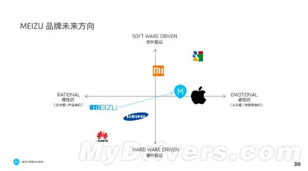
The logo redesign isn’t the only change the company hope to make. Currently they see themselves as a ‘rational’ brand with a slight emphasis on hardware, but they would like to switch that perception to become a more ‘emotional’ company. ‘Emotional’ in the eye of Meizu means ‘More like Apple’ a company that Meizu have long copied and followed.

In my personal opinion Meizu had a huge opportunity to strike it big last year but the company were too stuck in their ways to make important and necessary changes. I doubt that this new logo and hope to follow Apple more than they usually do will be enough to turn the brand around.


Place comments
0 Comments
You are currently seeing only the comments you are notified about, if you want to see all comments from this post, click the button below.
Show all comments